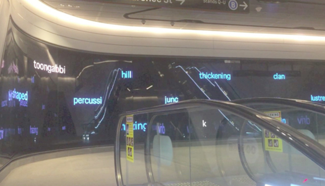
In early 2016 a call went out, seeking Expressions of Interest in a new segment of government infrastructure: ‘Transport for NSW is interested in commissioning moving image art for the “Wynyard Walk” between Wynyard Station and Barangaroo in Sydney’.[1] I was one of a small group selected to offer prototypes and, eventually, to generate a complete artwork.
The official brief explained the context:
From the early stages of planning for the pedestrian linkage between Wynyard Station and its reconfigured connections to and from the Barangaroo development on Sydney Harbour’s western foreshore, TfNSW decided that a large LED screen be installed within Wynyard Walk as an integral part of commuter travel routes for the primary purpose of captivating viewers with screen-based art in a public space.
And set the parameters:
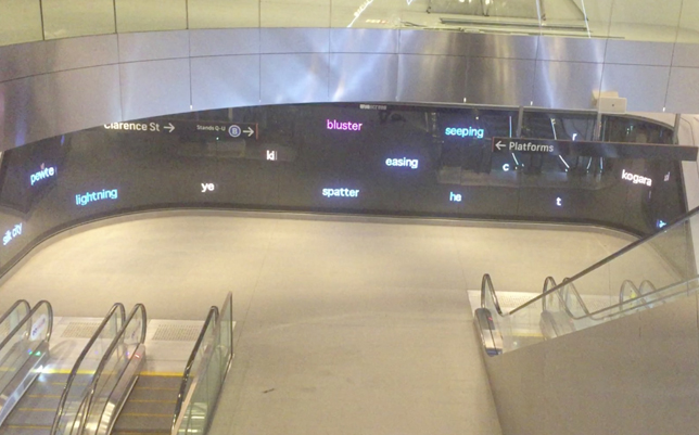
Wynscreen is a distinctively shaped LED screen, Width 22.75 metres (W22.75m) x Height 2.75 metres (H2.75m), installed at the mezzanine level of Wynyard Walk’s Clarence St Entrance. It is anticipated that more than 30,000 commuters and visitors will pass through this location every day, viewing the screen as they move along Wynyard Walk. TfNSW intends that Wynscreen will be solely for the presentation of commissioned works by mainly Australian artists, designers, animators, choreographers and other performers working with moving image whose diverse content – ranging from video art and animation to data visualisation and heritage interpretation – will continuously enliven and enrich the space. Essentially, Wynscreen will reflect the complexity of contemporary culture in Sydney and Australia by conveying how our histories have shaped ‘who we are’, ‘where we are’ and ‘what we may become’ in this country in the 21st century.[2]
One telling detail: in planning meetings, the project managers were careful to refer to the project not so much as ‘public art’ but as ‘urban design enhancement’. At first, this prompted some wry looks and wise-cracks from the artists, but it was clear that the project managers believed in ‘art’ and would perform all the shielding and shepherding necessary to allow the commissioned artists to get on with their work. Good faith prevailed and was greatly appreciated.
The repeated utterance of ‘urban design enhancement’ was partly a strategic gambit. As I understood it, the imperative was to avoid the histrionics that often surround the expenditure of public-infrastructural funds on something as useless and occasionally disruptive as ‘art’. ‘Urban design enhancement’. In fact I came to treasure the term because it clarified some defining features of the project. The artwork on the large screen really was meant to make the Wynyard Walk more functional, partly by making it more delightful and surprising – a place that people were keen to encounter - but partly also to aid in the process of flow that is the function of the walkway. The commissioned artwork was not meant to stop people in their tracks or make them behave, spatially and ergonomically, as if they were in an art gallery. Such traditional art-behaviour would clog up the walkway. Therefore a traditional art-attitude could not inform the production of site-specifically effective work. The artists had to enhance the design, to help flow happen and to draw pedestrians through and back to the concourse in ways that made the infrastructure a boon to everyday life rather than yet some other impediment or abrasion thrown into the diurnal toil of the workers and city-fossickers who must negotiate this part of town routinely. The artwork had to boost the dynamics of the walkway.
Moreover anyone who has spent time in great Asian cities such as Kyoto, Tokyo or Hong Kong will be aware of how carefully – indeed how exquisitely and artistically – the pedestrian throughways are presented. The aesthetics of these places are fastidiously considered and delivered, to the extent that it is a delight to come to them and move through them. Thus the aesthetic experience enhances the urban design. Enhances. Not merely decorates. Nor daubs with advertising. A ‘global city’ that hopes to compare well to its many competitors needs to excel in this provision of aesthetically and ergonomically enhanced public environments. Hence ‘urban design enhancement’. To be fit-for-purpose, the artwork in the Wynscreen had to facilitate the flow not only of people but also of sightlines, of expectation, of connectedness from this transport hub out to the near and far reaches of the city. Furthermore the contract with Transport for NSW highlighted three guiding principles: all commissioned work had to evoke the themes of Time, Travel and Place.
Modernist that I know myself to be, I felt compelled to respond to these strictures by making sure the artwork investigated and exploited the specificities of the medium from which it was to be constructed. In this case the medium is a large, scroll-like LED display, not a conventional cinema or television screen.
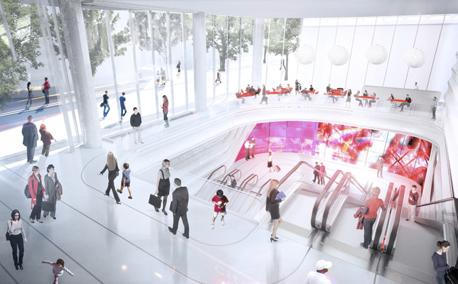
This type of surface struggles to present an image in the high-definition pictorial format that is now normal for televisions and cinematic projection. The Wynscreen is actually a vast array of individually-addressable high-performance light-emitting diodes. In fact rather than movie-imagery, the screen ‘prefers’ a scrolling-text display writ enormous. Think: roadside traffic announcements. Think: ‘Special Event “NO PARKING” Clearway Sunday 4.00pm – 11.00pm’. Ergo, I thought, why not work with this peculiar affordance of the Wynscreen; why not produce a textual artwork rather than a pictorial one?
I just had to make sure the texts could flow in ways that evoke Sydney’s special qualities of time, travel and space.
I thought, ‘this can be a piece of public poetry’.
A list of exemplars stacked up:
Jenny Holzer
Barbara Kruger
Miyajima Tatsuo
John Heartfield
The word paintings of Ed Ruscha.
Plus the current reigning champ of sculptural poetics, Robert Montgomery.
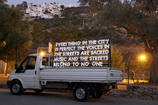
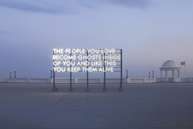
Moreover I noted some beacons less popular but no less mordant and lucidly focused:
The haiku tradition
Emily Dickinson
Ko Un
Robert Gray
Gary Snyder
Alice Oswald
CD Wright.
And curiously, from the intuitive channel I kept getting a message that Kraftwerk’s lustrous tune ‘Neon Lights’ needed to be there. Not the words, nor the sounds so much as a visual translation of the long glistering bridge-sequence of notes that carries the song to its finish. Also reporting intuitively was the looping, cumulative minimalism of musicians such as The Necks, Claudia Bonarelli and the German glitch-meisters Oval.
What were these musical exemplars suggesting? They are composed from spangled fragments all ‘shimmering’ (the word is Kraftwerk’s) in the perceiver’s consciousness in such a way that the music is understood as a sparse, pointillist wash of percolations rather than as a line of beats and melodies drawn through time from A to B. For instance there is a textural, synaesthetic quality to ‘Neon Lights’, with its sprinkles of notes delivering drafts and swirls and volumetric coruscations that feel like habitable effervescence. The same goes for the music of the Necks, Bonarelli and Oval. The listener feels somewhat like an astronaut space-walking through scintillations. Perhaps the words on the Wynscreen could have some of that spangle, some of that motility. But silently. Visually. Perhaps the words could move as the pedestrians cruise by, such that the letters and syllables fizz in vision (frontal and peripheral) and simmer in cognition as they deliquesce in the semantic part of the mind while quickly departing after retinal activation. If the entire screen were a field of these lustrous semantic events – haiku-short, evanescent, evocative and enigmatic – then a pedestrian’s experience of flowing past the screen could feel momentarily also like partaking of the energy that stipples there. The experience could be simultaneously purely aesthetic (zinging in the nervous system) and hermeneutic (riffing faster than cognition can occur in the portion of consciousness that translates noise into signal). That’s what I decided I had to deliver. The pleasure could come from the way a pedestrian’s passing body ‘dematerialises’ a little into the designed ‘excess’ of impulses offered by the screen, basted by frissons whilst not succumbing to anomie or disorientation. The pedestrian could move into this designed turbulence of luminous stimuli added to poetic promptings.
I recalled my favourite description of the way a haiku works: ‘the mind is struck as with a hammer, bringing the senses up short and releasing a flood of associations’.[3] Finessed as the visual equivalent of a polyphonic glockenspiel, perhaps the Wynscreen could offer hundreds of these little hammers operating as bubbling light. Maybe that’s what the screen could offer, the chance to move through a gentle flood of associations, to be spritzed by it, to enjoy a sensory buoyancy offered by the allure of electrical sparkle. As Kraftwerk intone on ‘Neon Lights’, ‘at the fall of night this city’s made of lights’. All that is solid might move like sparks efflorescing in the air. That’s what I resolved to deliver.
So the clues to the design of the Wynscreen piece began to gather. The artwork should not be some singular, transfixing statement addressing the viewer front-and-centre. Rather it should be a profusion of breath-phrases stippling across a twenty-metre array that offers more than the viewer’s mind can absorb. And this should feel like the pleasure of profusion – a metropolitan plethora – rather than like an unappeasable threat of apprehensive obligation or overload.
I recalled how this notion of exhilarating semantic saturation was vividly explained once in a television interview that I saw more than two decades ago. The filmmakers Joel and Ethan Coen were discussing their working methods, with particular reference to Miller’s Crossing. One of the brothers explained their approach to the writing and the performance of dialogue in the film. He told a tale about how, on the set of the great 1930s screwball comedies such as Howard Hawks’ Bringing Up Baby, there was a crew-member tasked with ensuring the lead actors spoke their sassy repartee at a tempo 30% faster than standard American speech. Thus the dialogue ran past the audience’s cognition at a rate greater than they could take in comprehensively. The speech became a kind of quick jazz. And it brought joy rather than some anxiety about interpretive insufficiency. For here was a fecund world, luscious, brilliantly unstinting in its pleasurable supply. The listeners felt lucky to be in this world. The effect was to convince the audience that these characters were more complex and wondrous than ordinary folk and that the world they dramatised outreached common-sense parsing. Here were super-humans, comic gods no matter how klutzy. The listeners were given a sense, thereby, that although their understanding was incomplete, this was no cause for distress; for in the world of the film there was a cornucopia of wit in the aural sparkle of the speech and physical activity offered by the main characters, who were embodied so blithely by Katharine Hepburn and Cary Grant. It seemed these characters came from a coruscating world, somewhere overflowing with energy and assignation, a world that outstrips the human systems we customarily deploy to know it. And it never stops, never depletes. It’s a wondrous world therefore, more wondrous even than language! And differently wondrous: you can use language to conjure such a world!
This reminded me of Andrew Benjamin’s notion of the aesthetics of ‘incompletion’. A defining quality of art, Benjamin observes, is the way a ‘good’ piece repays endless re-visitations and somehow never ‘exhausts’. Why look again and again and again at an Agnes Martin or a Mark Rothko? Why sit down to read Macbeth for a twentieth time? Benjamin observes that the artist often conjures an impression of complexity by manipulating absences or by inserting deliberate contradictions which goad the perceiver’s imagination or by leaving unsaid (or oversaid) the kinds of assertion that would sum up and put a stop to an inquest. The artist deploys an exquisite patterning of indeterminacy in the artwork. As a result, the person appreciating the artwork relishes the aesthetic and semantic plenitude of the piece, artfully unresolved as it is, incomplete but replete as it is because of the managed profusion of compelling interpretations that have been stitched into it.[4]
Such aesthetic payoff is the benign and mysterious side of ‘the Stroop Effect’. John Ridley Stroop was an American psychologist who came to prominence in the 1930s. He devised an experiment, which I’ll let an expert describe:
The Stroop effect is one of the best known phenomena in all of cognitive science and indeed in psychology more broadly. … In its basic form, the task is to name the color in which a word is printed, ignoring the word itself. When the word is a color word printed in a mismatched ink color, this is very difficult to do and results in slow, error-prone responding. To illustrate, consider GREEN [printed in red]: To say “red” to the ink color is difficult relative to a variety of comparison or control conditions such as naming the color of XXXXX [printed in red] or the word TABLE [printed in red] or even the word RED [printed in red]. The performance cost in the mismatch condition – usually referred to as the incongruent condition – relative to the controls is called the Stroop effect or Stroop interference.[5]
The effect of trying simultaneously to compute the data coming from an ‘incongruent condition’ means that the mind experiences ‘interference’ which impedes it from knowing how to perform the interpretation that it customarily delivers effortlessly and almost automatically. The learned processes of decoding have been scrambled by the need to deploy two different and incommensurable cognitive modes in the same instant.
An accidental Stroop Conundrum has been installed on a walking path near my home.
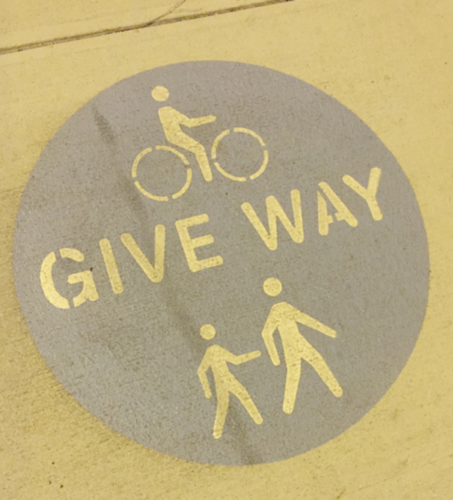
Encountering this sign when you are on the move, your thinking just stalls and crashes as you try to engage two modes of cognition – the pictorial and the linguistic – simultaneously in a time-constrained instant. ‘What is this portrayed scene?’, you ask. ‘Who gives way to whom or what?’ ‘In what circumstances?’ ‘In which direction?’ ‘What's with the exercise balls?’ ‘Or are they drain pipes some guy is hopping over? ‘Why do small people prod amblers from behind?’ ‘Is this an area where muggings occur?’ I’ve seen people stop and spend long seconds interpreting the sign as they are about to jog or ride over it. And of course little pile-ups pile up around it. It’s a mess of a traffic sign. But, in another context, it might not be a long way from being a good artwork.
When cognitive systems scramble Stroop-style, the mind tends to boggle. This can be catastrophic in an emergency. Or the interference can be somewhat psychedelic in a meditative sequence, koan-induced for example. When delivered at an exquisite pitch – as stimulation within a contemplative or artistic context, let’s say, rather than in the anxious time-frame of a potential road accident – the ‘stroopy’ shuttling back-and-forth between cognitive modes can generate uncanniness leading to revelation. It’s what the great zen gardens can do, presenting formal and textural conjunctions and disjunctions in such a way that the rocks and moss and raked sand work like a ‘mind device’ that has been constructed to send your usually-separated cognitive processes into interlocked oscillation causing transcendental alteration.[6] It’s what artists yearn to produce and what art-appreciators hanker to experience. It is the pay-off of incompletion; it is the insight that can come when you hover detached from habit or from the drive toward unambiguous, engineered utility.
William Empson’s Seven Types of Ambiguity is the classic study of such semantic plenitude in literature.[7] In spatialised display, as in the zen gardens and temples that I have already praised, the visitor experiences an environment that is ‘charged’ with a powerful ‘urge’ for some completion that is near but not yet achieved; there is a flowing potentiality that is more implied than shown. Norman Carver expresses it pithily. In Zen architecture, he explains, load-bearing elements often establish a ‘heavy structural beat’ (in roof-beams and wall-posts, for example) that gets counterpointed delicately by textures, surfaces and apertures (in paper screens, pebbled concrete and tatami patterns) all infusing the scene with a ‘rhythmic complexity’ to relieve or interweave with the beat.[8] The carefully set-up incompletion in the artwork drives a generative aesthetic that makes every encounter with the work a continuous event that occurs in the internal (or psychic) space of the visitor as well as in the external (or physical) space of the environment. (This dynamism of space is named ‘ma’ in the Japanese language.) After a while in such designed spaces the visitor often feels an urge to imagine patterns cohering everywhere even though such patterns are not explicitly present in the artfully ‘unresolved’ spaces that are being inhabited. (Spend a full day in one temple; it is a mind-altering exercise.) And the urge often helps one feel bonded to the environment, blended to some flowing integrity in it. As Carver proclaims to round out his argument: in Zen architecture, ‘all relationships are abbreviated and subtle, encouraging the exercise of the imagination in grasping the whole’.[9]
‘Abbreviated and subtle’. The literary side of Zen is instructive too. What you get from a haiku, for example, is a compulsion to imagine out from the detail, to get an inkling from the poem's intense fragment, an inkling that stimulates you to envisage a larger world that is replete with interconnections made instantaneously and intuitively comprehensible by the tiny shock that a good haiku produces. Which brings us back to Thomas Hoover’s ‘hammers struck in the mind’ and the ‘flood of associations’. Floods, flows, urges, surges, continuities: such words could attach readily to the Wynscreen.
So to work, to the Wynyard walkway. What to write and how to lay-out the texts across the challenging length of that Wynscreen? First point: keep the utterances abbreviated and subtle. Next point: develop a plenteous kind layout that feels carefully ‘incomplete’ and pleasantly restless, that outreaches, in an alluring and sustaining manner, the cognitive grasp of the appreciator.
With zen aesthetics already in mind, the famous pastel-blue screen at Katsura Villa in Kyoto welled up from my memory.
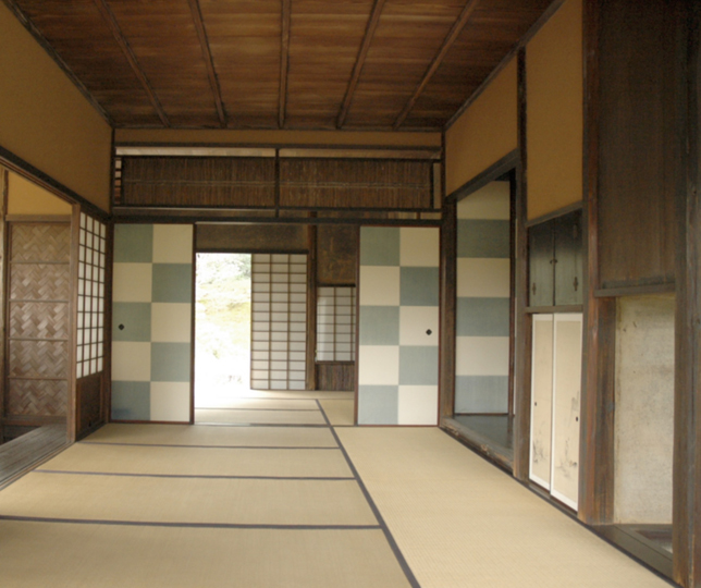
The grid pattern of the Katsura sliding screen is celebrated for the way it can be contemplated pleasurably over different periods of time. The counterpoint between the dusty blue and the chalky white causes a soothing undulation in retinal play. And the layout of the grid pattern, extending out past the viewer’s bodily dimensions, apprehensible as a full field, but always also inviting close, detailed inspection which requires the viewer to let go of the full frame in order to descend into appreciative detailing before then zooming out again to take in the entirety once more. To a certain extent it’s like a lullaby made material; but in other ways, curiously, it is gently stimulant, quietly rousing and activating your mind while the focus-shifts of attention generate a kind of gyroscopic momentum in consciousness. You can lose yourself and find yourself in contemplation of the Katsura screen. Look at it for a few seconds, look at it for an hour: either way, it delivers a palpable shimmer to your central nervous system.
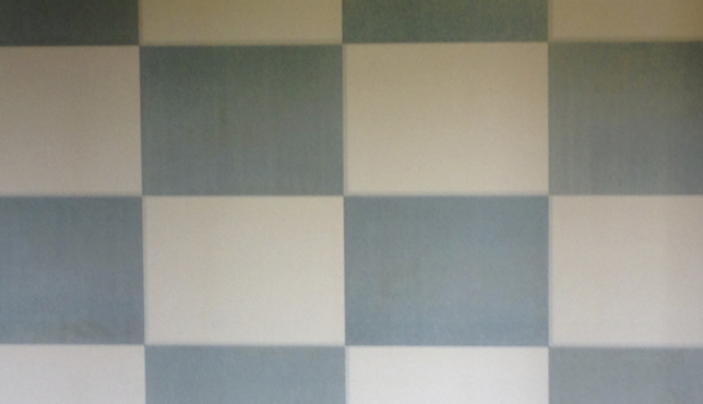
So I tried some experiments whereby I laid looping animated-text utterances – breath-short and haiku like in their concision, sometime runic – into a checkerboard pattern fitted to the Wynscreen. The utterances were my response to those poetic qualities of Sydney that move me most and that refer to the themes of time, travel and place. The segmentation of the screen into 45 blocks meant that each ticker-taping text shimmered within an aperture about the size of an adult’s upper torso. This proved an excellent scale, giving the animated words ‘heft’ and a kind of companionate animality in relation to someone walking up to and past them.
I designed the text-animations so that each utterance emerged letter-by-letter and scrolled through itself a few times until a new ‘breath’ pushes on-screen.
undulant moonglow undulant moonglow undulant moongloow undulant
obsidian harbour water bubbling obsidian harbour water bubbling obsidian
dawn birdcall gelid sky dawn birdcall gelid sky dawn birdcall gelid sky dawn
weather traffic weather traffic weather traffic weather traffic weather
plover shriek lightning flash plover shriek lightning flash plover shriek
signal driver signal driver signal driver signal driver signal driver signal
southern aurora in-bound gleaming southern aurora in-bound gleaming
I calculated there should be more than two hundred mutant haikus available to the blocks on the screen-surface, packed across the forty-plus segments. The entire grid would thus create a rich variety of visual patterns. Shimmering before meaning. If you tried to view all the checker-squares at once, you would not quite grasp the array, but you would sense how circulating texts ‘wanted’ to refer to each other and make larger statements in combination. (Mathematically there would be millions of combinations, given that each individual checker-text moved to another block once that text had occupied a particular block for a brief period.)

Testing the array, monitoring the texts while they percolated as an ensemble, I was encouraged to sense that another one of my theoretical precepts was actually working: namely, the hunch that the screen might show the truth of Charles Olson’s contention that poetry somehow gives substantial form to the projected breath and the proprioceptive presence of its orator. Or to say it more plainly, free from Olson’s bombast: poetry can be felt in the body as well as the mind of the appreciator because the patterning of the words comes across from the poet to the audience with a corporeal impact that bumps the listener into compelling new experiences of rhythm in space and time, all conducted by the orator.[10]
As the prototyping continued, I winnowed the distribution of verbal luminance down to a ratio where half the squares in the checkerboard carried texts and the other half were left blank. Furthermore I simplified the colour-scheme. I had tried working with the dusty blue and the chalky white background colours for the checkerboard, but the LED system delivered too much radiance in the whites. However when I tested a uniform black background, the screen ‘settled’ easefully and, as a bonus, the hardened glass that protected the diodes served to deliver a fractal kaleidoscope of reflections and refractions, such that words proliferated, reversed and diminished in virtual, 3-D depth even as they also ran across the 2-D plane of the flat grid. Passers-by were transponded as fleeting ghost-images into a deep virtual space behind the screen. The black had to stay! So, the chalky white dropped from consideration, while the dusty blue became the main colour for the texts rather than for the screen-background.
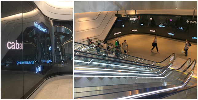
The extra good news was that, perceived in the wide view, the winnowed checkerboard worked somewhat comparably to the Katsura Screen. In a meditative fashion, the viewer enjoyed contemplating its full extent and its distributed, stippled activeness. It did not feel like a sensory assault; it was not exhausting; nor was it disorienting or vertiginously disturbing to walk up to and past.
So, with both the close view and the wholistic reception working well, I set about compiling the database of breath-short utterances. As a critical mass of utterances assembled, they associatively suggested additions to the ensemble, and over a few months the full contingent of texts accrued to evoke the phatic intensities of special places in Sydney as well as the various historical time-settings that one can sense to be still lively here when traveling across the lambent landscape in ferries, trains and buses. Enduring a cull in final edit, the surviving words were set to fizz and sparkle like snapshot glimpses of the city's reverie. Among the texts, additionally, an underlying yet insistent ‘map’ of indigenous place names pushed through frequently to show how the world's oldest continuous culture, with its vivacity and responsiveness to the spirit of the location, still energises the city.
Here’s how a recent reviewer described the end-result:
The basis of the work is a number of words: suburbs in Sydney, Indigenous placenames and descriptions of natural phenomena. Letter by letter, the words form across the screen in three rows. As an array accumulates horizontally, the shape behaves like a slowed bluster of movement, like wind blowing leaves across the ground or light sparkling on the harbour.[11]
I confess I was also trying to suggest the flickering of cabin lights in passing trains and ferries. And the glitter of cars hurrying high on the Harbour Bridge, glimpsed from below late at night. And a kind of seductive warm shiver that lives in the city, no matter the season.
The piece is called ‘Bluster Town’.
Notes
[1] Draft Contract with Artists, Artmap Studios and Transport for NSW, p.1
[2] Artmap Studio, ‘Artist Brief’, Sydney: 2016, p.1. Available throughout 2016 at www.artmapstudio.com/wynscreen
[3] Hoover, T 1978 Zen Culture, London: Routledge & Kegan Paul, p. 205
[4] See Benjamin, A 2004 Disclosing Spaces: On Painting, Manchester: Clinamen Press
[5] Colin M. Macleod, ‘The Stroop Effect’ in Encyclopedia of Color Science and Technology, New York: Springer 2015, p.1181
[6] Hoover, p. 227
[7] Empson, W 1947 Seven Types of Ambiguity, second edition, London: Chatto and Windus (first published, 1930)
[8] Carver, N A 1965 Form and Space of Japanese Architecture, Tokyo: Shokokusha, p.65.
[9] Carver, p.156. See also Burch, N 1979 To the Distant Observer: form and meaning in the Japanese cinema, London: Scolar Press, for a comprehensive explanation of how this aesthetic pervades much Japanese cinema.
[10] See Charles Olson’s celebrated and much debated pamphlet from 1950, ‘Projective Verse’ https://www.poetryfoundation.org/resources/learning/essays/detail/69406
See also Olson 1965 Proprioception, San Francisco: Four Seasons Foundation.
[11] Harris, L C 2017 ‘Art as big public infrastructure’, Real Time 138, April- May. http://www.realtimearts.net/article/138/12570